

Tímea Andorka is a hugely talented designer and illustrator who lives in Budapest, where she has created a number of beautiful book covers for Hungarian editions of numerous authors. She was kind enough to let me interview her a few days ago. (See her portfolio here.) Click any image for a much bigger version.
* * *
CAUSTIC COVER CRITIC: You design work for a whole range of fields--posters, DVD covers, art exhibitions, music: how did you first get into the field of book design?
TÍMEA ANDORKA: I am interested in a wide variety of things that have connections to the world of ideas and creativity. This realm allows me to experiment with the experiments of others and with my own thoughts. Book design is that particular field which emerges as the most challenging for me. I have always been a bibliophile. At university, I studied philosophy and literature and that was followed by learning graphic design and typography. When I design a book cover I make use of everything I’ve ever learned. I consider book design as a mode of reflecting on texts, a kind of interpretive activity. Since it always puts my competence to the test, I really enjoy doing it.
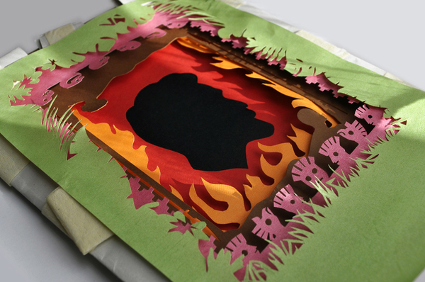
 |
| Vargas Llosa's The Dream of the Celt, created using layered paper cutouts |

CAUSTIC COVER CRITIC: So much of your work involves real, physical objects (the apples, the paper cutouts, the physical objects used in the Mérleg könyvek covers) where other people would be tempted to do it all on computers. Why do you prefer the real-world artwork?
 |
| An essay on falling in love gets some dramatically conjoined apples... |

TÍMEA ANDORKA: I am not an expert in drawing so I am compelled to look for alternative solutions. Moreover, the directedness of the figural representation bounds the imagination of the reader and I prefer to mobilize her and involve her in the process of interpretation.
 |
| Some of the many apple photographs taken for the cover design |
Sometimes all you need is an ingenious typographical invention, a type composition put together on computer or something alike – now I can’t help thinking of the amazing works of David Pearson: his covers have transformed my overall attitude to books. However hand made design provides thousands of possibilities. I like the contingency of manual work, the unforeseen intervention of chance in the process of designing. This offers me more ways of approaching the problem than working with the computer. I adore Polish poster art, the graphic applications of objects in the work of Michal Batory and Tomasz Bogusławski. Then again, paper remains my favourite matter; with and from paper you are capable of making literally everything.
 |
| The Hungarian edition of The Catcher in the Rye |
CAUSTIC COVER CRITIC: Your Salinger cover is great...
TÍMEA ANDORKA: Thank you. It was quite an experience.
CAUSTIC COVER CRITIC: I know he had very strict rules for cover designers (text only, no illustrations, etc). What was that experience like?
TÍMEA ANDORKA: Given the strict rules I had no other option than to make a pure typographical design. Eventually I made a design in which the h, o, l, d, e, n letters jump out somehow in a readable fashion from the very letters of the author’s name and the title of the book. While I was designing the final version I was feeling unable to figure out any other idea. Although, I had to redesign even that. I hope the readers will not perceive any of the difficulties.


CAUSTIC COVER CRITIC: With the Mérleg könyvek covers you have to have a unified look for such a wide range of writers. How hard was it to create a series look that let each writer's individuality still show through?
 |
| From the Mérleg könyvek series redesign |


TÍMEA ANDORKA: The Mérleg series was my thesis in graphic design. At first I had to invent the leading conception of the series. Since all books are made of paper, I had decided to rely on the materiality of it – the possibility of folding, cutting, tearing, burning, soaking, layering it. The paper-based letter compositions stand in a reflexive relation to the content of the book This idea gave me the way to accomplish a unifying project and, at the same time, every single work could keep its peculiarity. Besides, hand made objects can never be immaculate and the tiny deviations and inequalities add an extra variability and dynamism to each piece.


CAUSTIC COVER CRITIC: Is the Hungarian publishing world as confused and alarmed by electronic books as the English-language equivalent? How do you think this will affect the future of book design there?
TÍMEA ANDORKA: E-books haven’t caused a confusion here yet, because there are only a few books available in this format in Hungarian. As the polls show people in Hungary have an interest in this product, so the time will undoubtly come soon when we have to face this problem. Anyway, I don’t think that e-books may radically change the world for designers. I mean that the mere functionality will never replace the complex aesthetics and materiality of the book as an object. And until the ’book-object’ survives we always will have our task to do.
CAUSTIC COVER CRITIC: What book, out of any ever written, would you love to completely design if you had no editorial or budgetary constraints?
TÍMEA ANDORKA: I would choose something with a special position in the history of ideas – something with both literary and theoretic importance. I am thinking of such works as The one hundred and twenty days of Sodom or The picture of Dorian Gray or Thus Spoke Zarathustra. Or, if I can be a little immodest, the Holy Bible. These works would pose a really exciting challenge in graphics for me since they have their own iconographical tradition.
 |
| Poster designs |

CAUSTIC COVER CRITIC: Finally--all of the Hungarian fiction that gets translated into English that I've read has been wonderful (Dezső Kosztolányi, the Karinthys, Miklós Bánffy, Gyula Krúdy, László Krasznahorkai, Tibor Déry, Géza Csáth, Imre Kertész, Antal Szerb, Sándor Márai, etc). Who are your favourite Hungarian writers? Who should we be campaigning publishers to translate into English?
TÍMEA ANDORKA: I am glad you have read so many Hungarian authors; I am fond of them as well. I can’t pick anybody as my favourite writer but I wholeheartedly draw your attention to the works of Attila Bartis. His novels (Promenade and Tranquility) have been translated to English, I am certain of that, but there is also a collection of his short stories under the title The Lazarus Apocrypha. As far as I know, this book – which I find the best of his works – is still to be translated.
 |
| Poster designs |

As regards your question, I recommend you to read, translate and publish the works of György Petri, Dániel Varró, István Örkény, Sándor Tar, György Spiró, László Garaczi and Lajos Parti Nagy.
CAUSTIC COVER CRITIC: Thank you, Ms Andorka! (And I've order Tranquility straight away!)
Here are some photos Tímea took, showing the creation of the Mérleg series...
.jpg)
.jpg)
.jpg)
.jpg)
.jpg)
.jpg)
.jpg)
.jpg)
.jpg)
.jpg)
Here are some photos Tímea took, showing the creation of the Mérleg series...
.jpg)
.jpg)
.jpg)
.jpg)
.jpg)
.jpg)
.jpg)
.jpg)
.jpg)
.jpg)


4 comments:
Wow, these are some beautiful covers!
The Catcher in the Rye cover is a genius use of extreme constraint in the brief.
On a purely selfish and entirely hypothetical note, I'd love to see a Five Wounds cover design by Timea. ...
She is clearly amazing. I love the paper distortion covers particularly. The book as an object isn't explored enough, I think. A while ago Jonathan Franzen went mental at e-books because he loved the physical solidity of a real book. I reckon he'd go mental for these (in a good way). What a genius!
She really is. I wish I could read Magyar so that I could justify buying the set of Mérleg könyvek books. Frankly, I'm tempted to do it anyway, just to have them as lovely objects--they're that beautiful.
Post a Comment