Because I will be doing a monthly thing next year with the mighty Brad Bigelow about novellas, here's the full list of 100 great short books I recommended on Twitter, in one place for ease of reference.
***
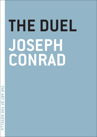
1. THE DUEL: Joseph Conrad: genuinely funny novella about a Napoleonic officer being stalked over a period of years by a madman determined to fight a duel.
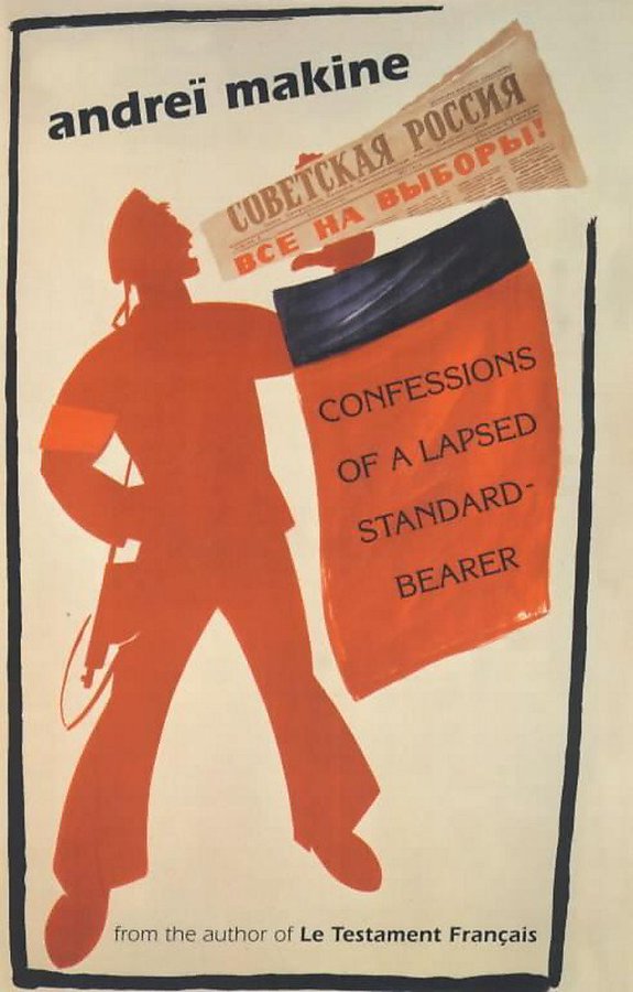
2. CONFESSIONS OF A LAPSED STANDARD-BEARER: Andreï Makine: maybe his most Chekhovian book, about Alyosha and Arkady, Young Pioneers in post-WW2 Leningrad; an oddly sweet book about terrible disillusionment
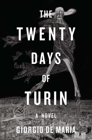
3. THE TWENTY DAYS OF TURIN: Giorgio De Maria: a political library of personal diaries inadvertently leads to a plague of mass psychosis and death; uneasy plague reading
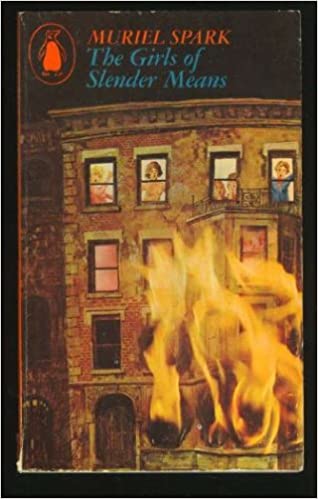
4. THE GIRLS OF SLENDER MEANS: Muriel Spark: pretty much any book by Spark would fit this list, but this might be my favourite; the erotic/emotional hothouse of a girl's boarding house during the Blitz with an unexploded bomb on the premises
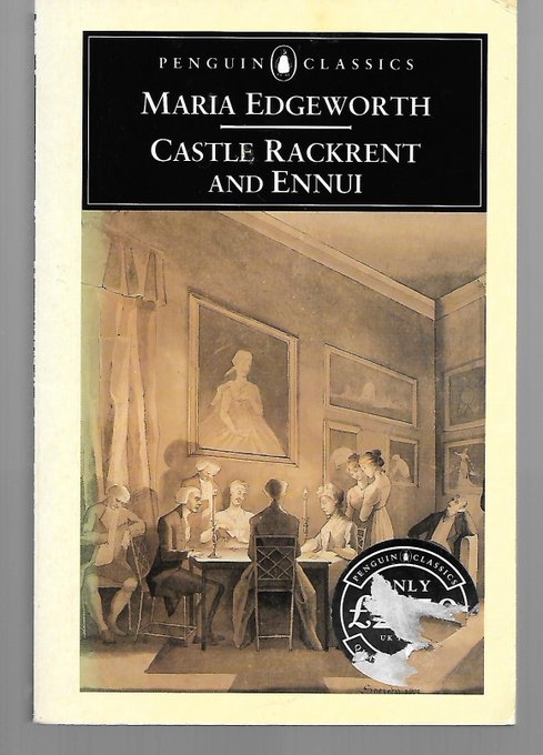
5. CASTLE RACKRENT: Maria Edgeworth: another black comedy with duelling in it, plus obsession, intra-marriage warfare, politics and endless bad behaviour; the first Irish Big House saga, and it's only 90 pages
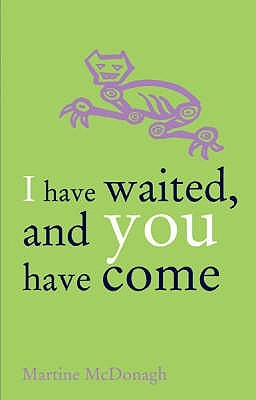
6. I HAVE WAITED, AND YOU HAVE COME: Martine McDonagh: a woman's life in sodden, semi-ruined post-Climate-Change England is disrupted by a man who has fixated on her; subtle, vivid and beautifully written
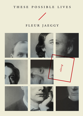
7. THESE POSSIBLE LIVES: Fleur Jaeggy: Three short essays about the lives of three writers, making up an absolutely brilliant tiny book which loops through absurdities and weirdnesses, history and art. Fascinating and amazing.
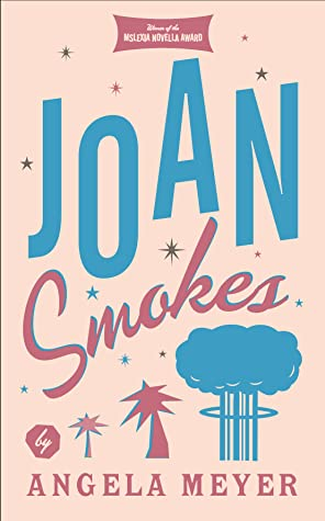
8. JOAN SMOKES: Angela Meyer: a woman on the run from her past arrives in 1960s Las Vegas and reinvents herself in this noirish, fragmented novella
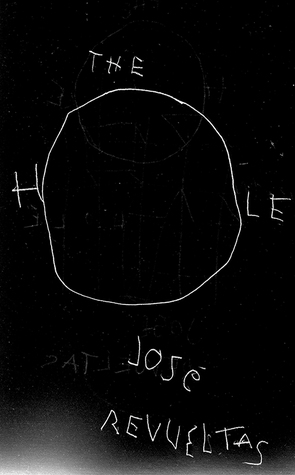
9. THE HOLE: José Revueltas: one of the most intense little books you'll ever read, positively humming with malignant energy; three Mexican prisoners scheme to bring drugs into their prison, and everything goes wrong
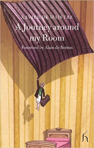
10. A JOURNEY AROUND MY ROOM: Xavier de Maistre; perfect isolation reading; XdM was put under house arrest after a duel (DUELS AGAIN!) in 1790, so he wrote a travel book for the room he was trapped in--like a proto-Proust doing stand-up
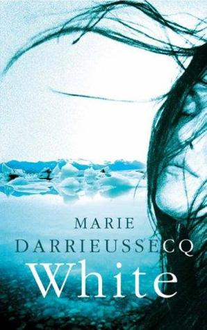
11. WHITE: Marie Darrieussecq: how about a tentative romance at a near-future Antarctic research base watched over by the ghosts of the many polar dead?
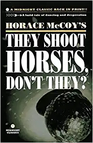
12. THEY SHOOT HORSES, DON'T THEY?: Horace McCoy: the best noir novella about death and non-stop dancing ever written
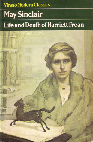
13. THE LIFE AND DEATH OF HARRIET FREAN: May Sinclair: near-perfect unhappy short novel of self-destruction via doing the expected thing. Sinclair's only novel, though she was also a dab hand at ghost stories.
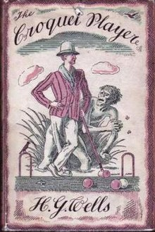
14. THE CROQUET PLAYER: H G Wells: speaking of ghosts... if they're the product of violence, what about all the blood shed by Neanderthals and other pre-modern humans as they struggled to the top of the evolutionary ladder? Unusual and little-known Wells, but still very much it.
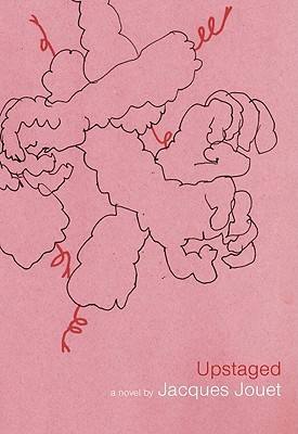
15. UPSTAGED: Jacques Jouet: a famous actor is captured, bound, gagged and stripped by his doppelgänger, who takes the stage in his place and begins to drag the world into chaos. Oulipian fun.
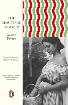
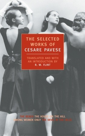
16. THE BEAUTIFUL SUMMER: Cesare Pavese: 1930s Italy, intense female friendship, first love affairs, discovering art and independence: get hooked on this, then move on to his 'Selected Works' from NYRB for four more brilliant novellas.
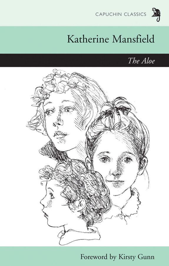
17. THE ALOE: Katherine Mansfield: a rare longer work by one of the greatest short story writers in lit history, an early but quite different take on what would become her 'Prelude': a captured moment of time in a NZ family's life circa 1900: magical, frankly
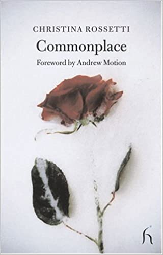
18. COMMONPLACE: Christina Rossetti: rare fiction from the great poet--three sisters tackle love, duty, marriage and independence in very different ways after the death of their parents.
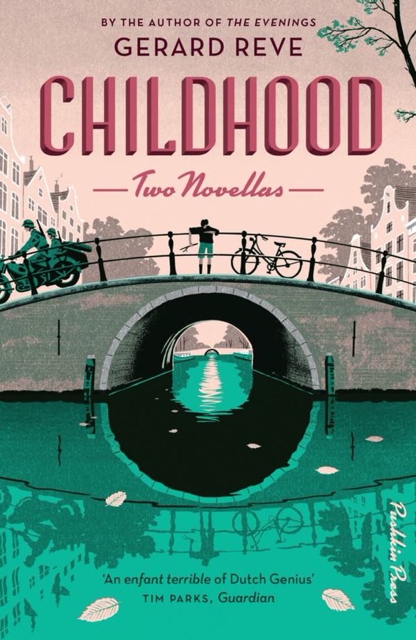
19. WERTHER NIELAND: Gerard Reve: (published with another novella as 'Childhood') -- enjoy the company of an 11yo mystic and probable psychopath as he forces his 'friends' to join him in a series of dangerous and esoteric clubs in occupied Amsterdam
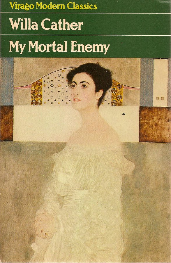
20. MY MORTAL ENEMY: Willa Cather: as a child and then an adult, Nellie is obsessed with the life and loves of an older woman from her home town; she encounters and re-encounters her throughout her life
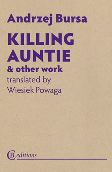
21. KILLING AUNTIE: Andrzej Bursa: you're young, you're bored, you murder your aunt, you dismember the body, you try to get rid of it, you meet a girl, you fall in love... we've all been there. Posthumously discovered blacker-than-black stuff from 1950s Poland.
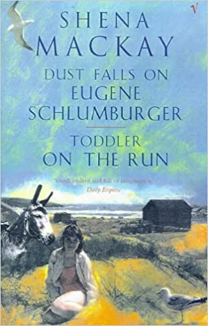
22. TODDLER ON THE RUN: Shena Mackay: Morris, a grown man less than 4' tall, is on the run from the law and hiding out in a beach hut, besets by donkeys, beachside evangelists and British holidaymakers.
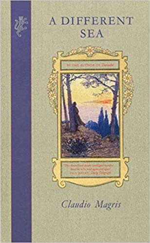
23. A DIFFERENT SEA; Claudio Magris: a young intellectual flees Austria-Hungary for the Patagonian pampas and reading Greek classics after his hero and mentor commits suicide; his search for an "authentic life" is completely fucked over by the inevitable unpleasantness of history
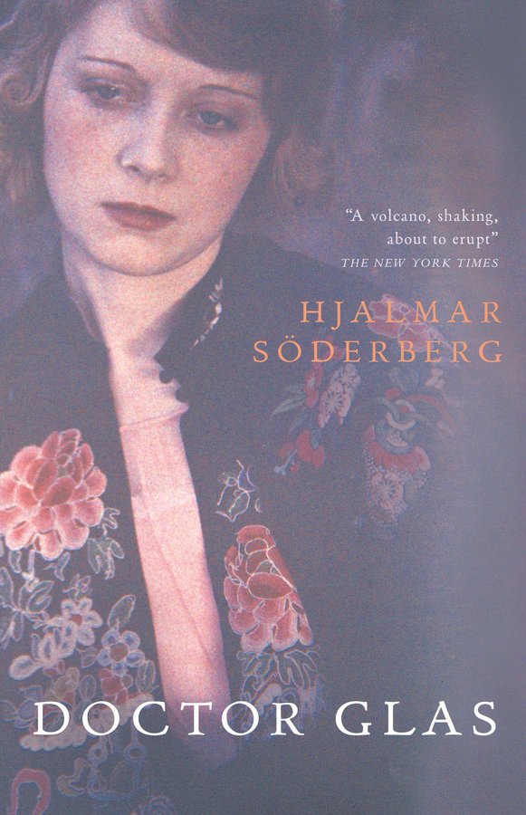
24. DOCTOR GLAS: Hjalmar Söderberg: brilliant, dark 1905 Swedish masterpiece about a depressive doctor in love with a woman whose monstrous clergyman husband insists on his "marital rights"; complications ensue, as they say
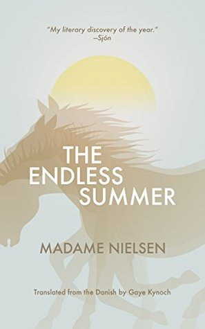
25. THE ENDLESS SUMMER: Madame Nielsen: modernist, beautifully done group portrait of a family and various hangers-on over the course of a rural Danish summer
26. BAD NATURE, OR WITH ELVIS IN MEXICO: Javier Marías: Elvis is in Acapulco to film a movie, and in the boozy chaos his interpreter gets stuck in a cantina full of violent and talkative criminals
27. REUBEN SACHS: Amy Levy: 1880s feminist Jewish novella of snobbishness, love and bad marriages, written in partial reaction to DANIEL DERONDA.
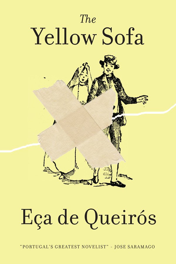
28. THE YELLOW SOFA: José Maria de Eça de Queirós: short, intense black comedy of infidelity and outraged morals by 19th-Century Portuguese genius
29. THE ALIENIST: Machado de Assis: budding Brazilian psychiatrist and asylum-keeper discovers that the more he learns about his field, the more insane everyone around him becomes
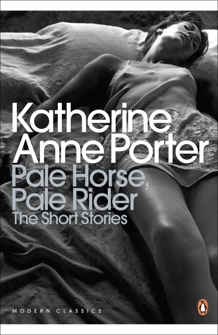
30. PALE HORSE, PALE RIDER: Katherine Anne Porter: obvious choice--the great novella of the Spanish Flu outbreak, a modernist masterpiece told from the POV of a fevered woman lying in her sickbed, her childhood memories mingling with those of the war and the plague deaths
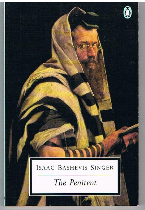
31. THE PENITENT: Isaac Bashevis Singer: deeply uncomfortable novella about a man desperate for salvation, retreating into Orthodox Judaism and dedicating his life to becoming a penitent
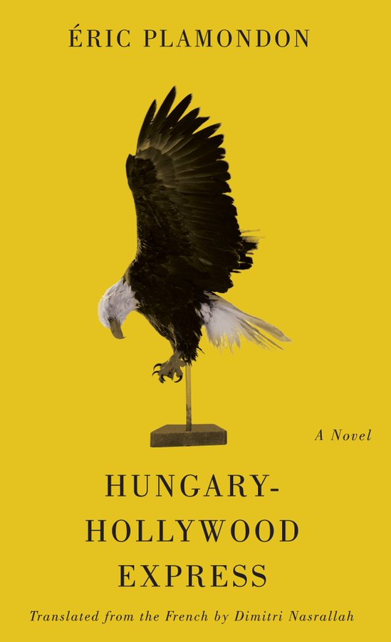
32. HUNGARY-HOLLYWOOD EXPRESS: Éric Plamondon: rambling post-modern fictionalised biography of Hungarian Olympian and Tarzan actor Johnny Weissmuller, leaping discursively around the erratic weirdness of the 20th Century
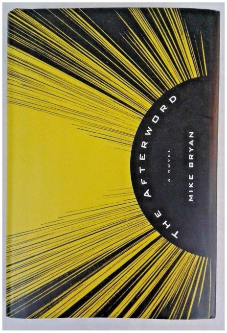
33. THE AFTERWORD: Mike Bryan: a novella in the form of an afterword to a non-existent American bestseller about faith and God in America
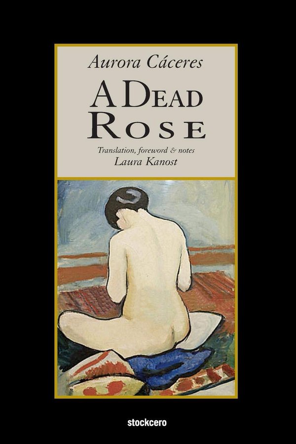
34. A DEAD ROSE: Aurora Cáceres: minor symbolist masterpiece from Peruvian Europhile, about an afflicted Parisian woman who starts an affair with her gynaecologist
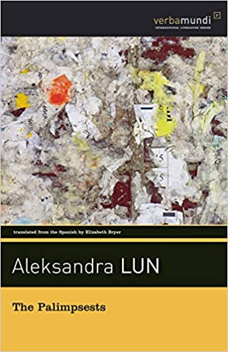
35. THE PALIMPSESTS: Aleksandra Lun: Demented remix of literary history, especially of writers who write in languages other than their own; hugely daft, lots of fun
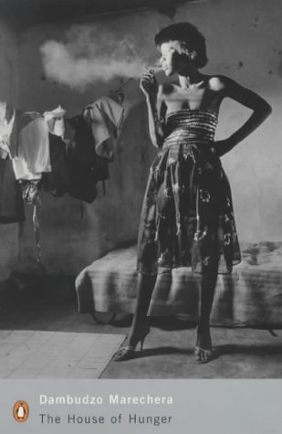
36. THE HOUSE OF HUNGER: Dambudzo Marechera: vivid, harrowing and linguistically acrobatic masterpiece of alienation about growing up in the slums of Harare; sadly Marechera was killed by alcoholism and AIDS by the age of 32
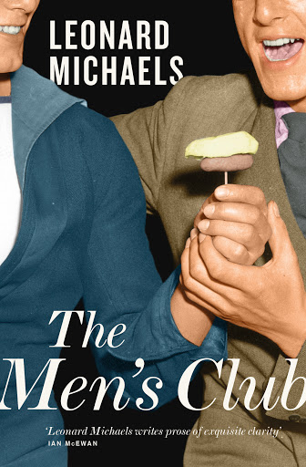
37. THE MEN'S CLUB: Leonard Michaels: hilarious and appalling, maybe the ultimate deconstruction of the delusions of the straight male, about a group of seven friends who decide, for reasons none of them are able to really articulate, to start a club for men
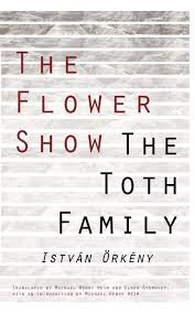
38. THE TOTH FAMILY: István Örkény: a Hungarian family is terrorised by a deranged army major on leave, forced to become a cardboard box assembling operation in their own home (comes with another fine novella, THE FLOWER SHOW)
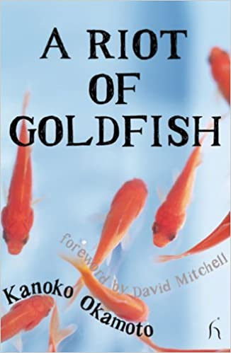
39. A RIOT OF GOLDFISH: Kanako Okamoto: wonderful 1937 novella about an obsessive goldfish breeder in love from a little-translated Japanese poet and scholar of Buddhism (and mother of artist Tarō Okamoto)
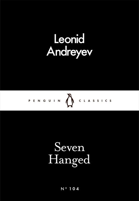
40. SEVEN HANGED: Leonid Andreyev: appropriately grim novella of the last days of a group of Russian dissidents in Tsarist Russia; beautifully written, absolutely designed to sap your joie de vivre
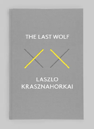
41. THE LAST WOLF: László Krasznahorkai: funny, obsessive, one-sentence novella about a man hired by mistake to write about Europe's last wild wolf; also a perfect introduction to a sometimes forbidding writer
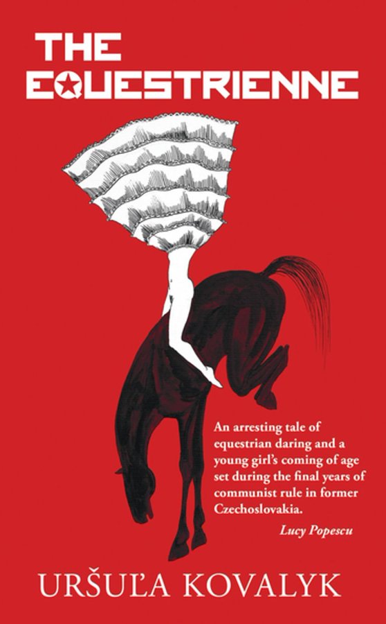
42. THE EQUESTRIENNE: Uršuľa Kovalyk: late-Communist Czech-set black comedy of adolescence, female friendship and trick horse-riding
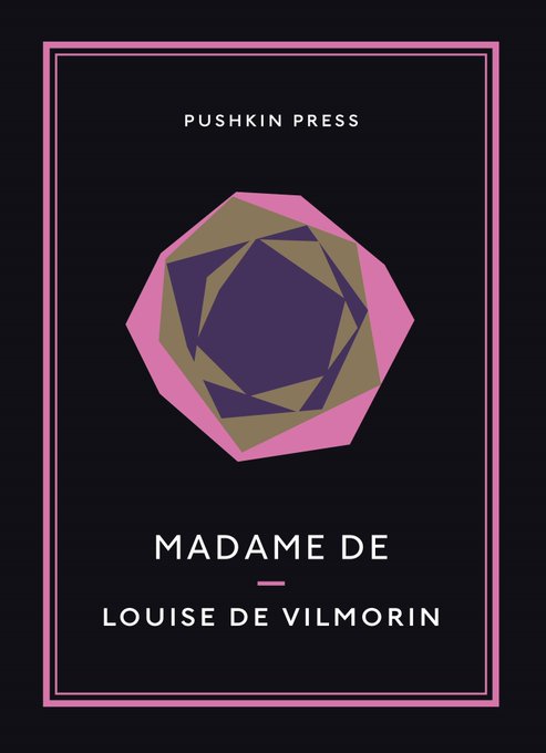
43. MADAME DE: Louise de Vilmorin: the story of a pair of diamond earrings and the betrayals and deceit they cause as they pass from person to person; a perfect, appropriately jewel-like miniature
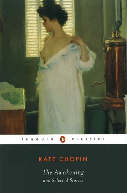
44. THE AWAKENING: Kate Chopin: probably ruined for many Americans by being forced on them in school, but this really is one of the most perfect short novels, about a woman undone by her quest for freedom and self-honesty
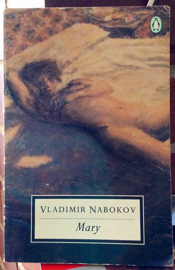
45. MARY: Vladimir Nabokov: his first novel, a short and intense story of White Russian exiles in Berlin, nostalgia, erotic and romantic obsession, and a cunning plan
46. TALKATIVE MAN: R K Narayan: a late, short novel in the Malgudi cycle, whose loquacious narrator tells the story of a mysterious man, allegedly part of some ill-defined UN project, who turns up at the railway station, takes over the waiting room, and refuses to leave
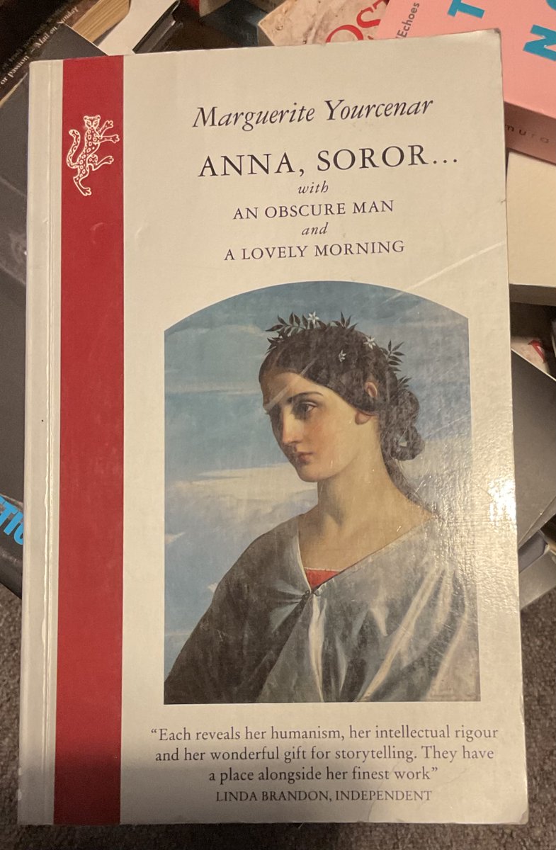
47. COUP DE GRÂCE: Marguerite Yourcenar: more White Russians, plus a German aristocrat, a collapsing Baltic siege and a love triangle--something for everyone!
48. ALL SAINTS' MOUNTAIN: Olga Tokarczuk: unsettling, excellent science-fiction novella by the Nobel laureate from last year who ISN'T a scumbag; free online (not in book form as yet): see it
here.
49. THREE YEARS: Anton Chekhov: picking one Chekhov is like choosing your favourite diamond from a vast trove of perfect diamonds, but this is as good as anything else he wrote--a subtle and brilliant "novel of Moscow life"
50. A MONTH IN THE COUNTRY: J L Carr: the ultimate piece of evidence that shows you don't need more than 84 pages to write an absolutely perfect novel--if you haven't read this then no wonder your life is a pointless, empty void